Magic Patterns: A Little More Magic
Project Overview
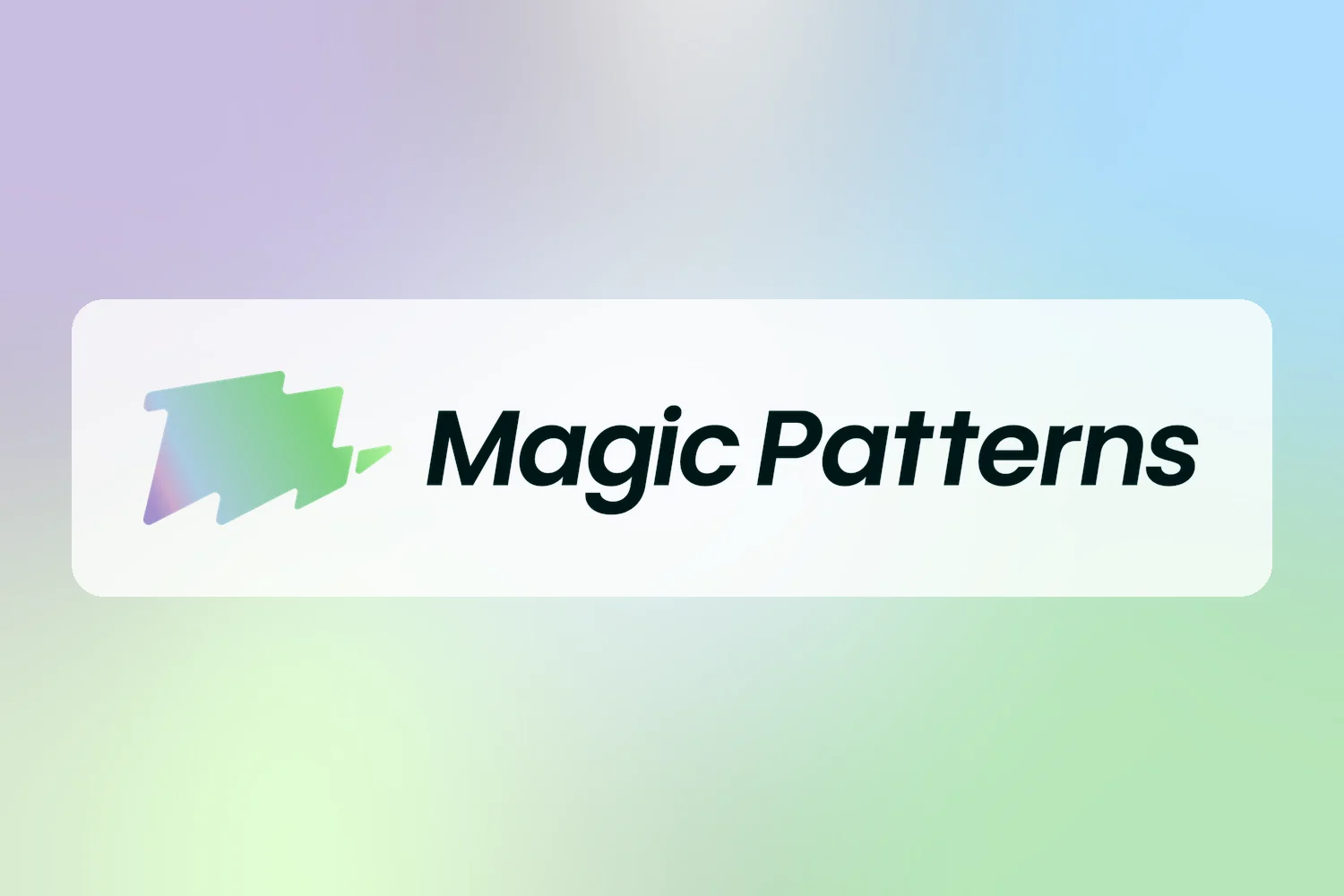
Magic Patterns already has a great name and a strong mark. This self-initiated concept explores how a few small, deliberate changes could make the logo feel as magical as the product: shifting the mark to echo the “M”, adding a sparkle that points up and forward, and skewing the wordmark into motion.
Making Magic Patterns feel a little more magical.
Design changes how people feel about a product before they ever use it. Magic Patterns already has a great name and a strong mark — this concept leans into the “magic” with three small, deliberate moves: magic, movement, and motion.
Before & after
Drag to compare





How we get there
Three small moves, One Big Feeling
-
01 · Magic
Shift the mark to echo the “M”
A slight shift in the mark’s angle creates a visual tie-in with the M in Magic. The symbol and the name start speaking the same language.
-
02 · Movement
Add a sparkle with direction
A final spark breaks off the mark and points up and forward — a direction of growth. It’s the moment an idea turns into something real.
-
03 · Motion
Skew the wordmark into motion
A subtle forward skew on the type gives the whole lockup momentum — it reads fast, confident, and already in flight.
This is just the spark
Where a little more magic could go next
-
Motion identity
Turn the reveal above into a real logo animation — for loading and “generating” states, launch videos, and social.
-
Brand system refresh
Carry the angle, sparkle, and skew into icons, illustration, color, and type so the whole product feels like one idea.
-
Launch & social kit
Templates and assets that make every announcement, changelog, and demo instantly recognizable as Magic Patterns.
-
Events & community
Booth, swag, and slide design for moments like San Diego Design Week — where first impressions happen in person.
Want your brand to feel a little more magical?
Small, deliberate design moves can change how people feel about a product before they ever use it. Let’s find the ones that fit yours.
Explore More Work
Style Guide Visual Identity
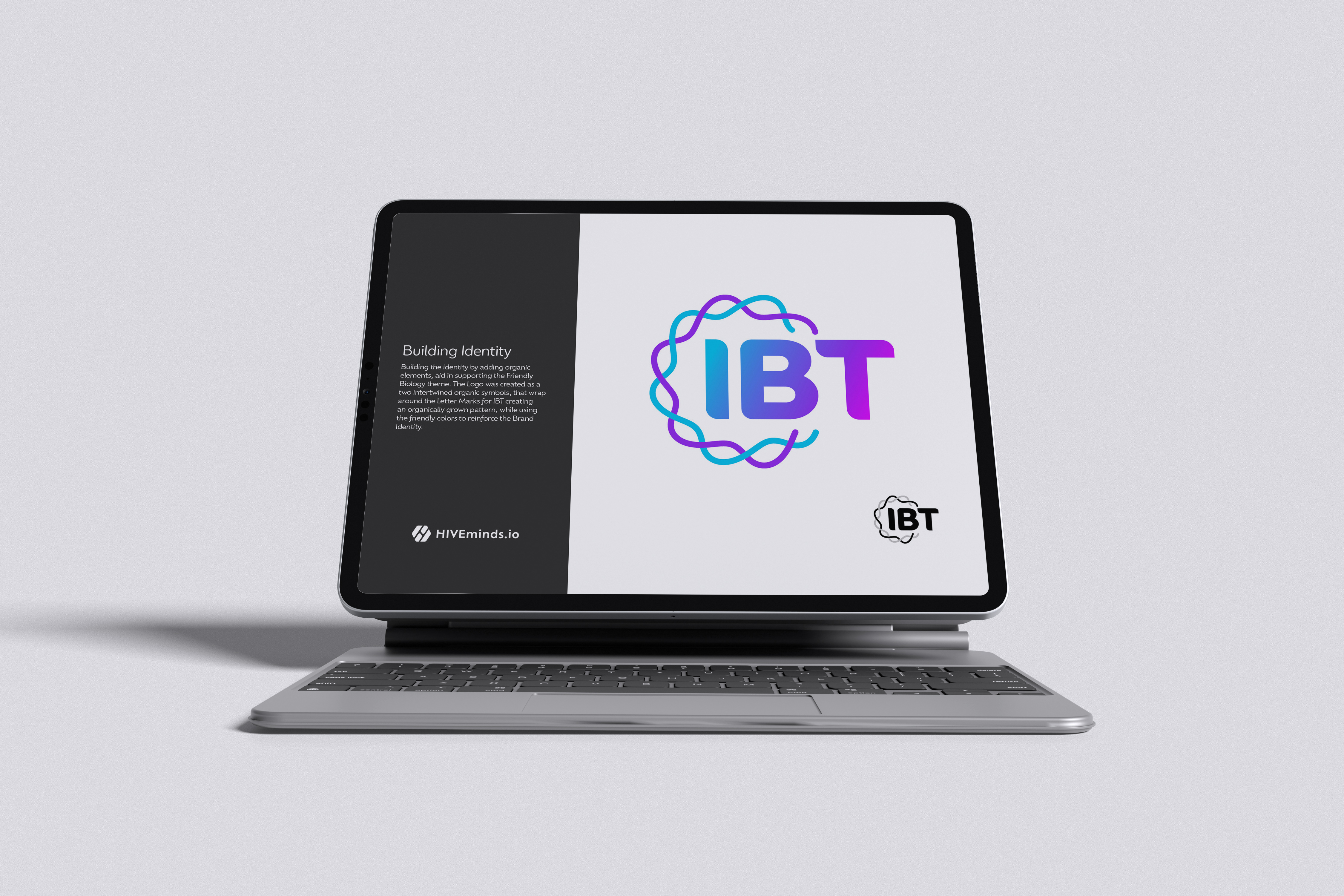
Innovative BioTherapies Style Guide
Innovative BioTherapies, Inc. (IBT), is a for profit company founded in 2003, by Dr. H. David Humes, Professor of Medicine at the University of Michigan, to facilitate the commercialization of technology developed in his academic laboratory.

Logo Design Branding Multi Clients
Strategic Logos that Set the Stage for Your Brand Story
A logo is the start of a good brand because it creates the first impression, communicates identity, and sets the tone for all visual and emotional connections that follow.
Art DesignLogic Creativity
Imagination Unleashed
Sometimes, it’s refreshing to step back, stretch your legs, and create purely for the joy of it. Here’s a look at some of our passion-driven creative work — no deadlines, just imagination.

Logo Design Style Guide Brand
Ford Plumbing: Crafting a Timeless Visual Identity
We partnered with Ford Plumbing to deliver a comprehensive Visual Identity Package designed to elevate their brand presence.