Branding and Style Guide for an All New SharpeSoft

Since 1986, SharpeSoft has been a trusted name in the construction and project management industry. For nearly four decades, the logo stood as a symbol of reliability, innovation, and progress. But as the world evolves, so do we.
With the expertise of HiveMinds.io, we’ve reimagined the logo to reflect a modern identity that honors our legacy while preparing us for the future. This new design, crafted with precision and purpose, embodies the balance of boldness and clarity that SharpeSoft stands for. It’s a symbol of the precision, efficiency, and forward-thinking approach that defines the HiveMinds creative work.
We invite you to explore the journey behind this transformation and see how this new chapter bridges the past and the future for SharpeSoft.

Willam Ontiveros
SharpeSoft
For nearly 40 years, SharpeSoft has been a trusted name in construction software, and our logo has been a big part of that identity. But as we’ve grown and evolved, we knew it was time for a refresh—something that honors our history while looking ahead to the future. That’s where HiveMinds.io came in.
From the start, their team took the time to really understand who we are, what we stand for, and where we’re headed. The result? A modern, refined logo that perfectly captures our precision, efficiency, and forward-thinking approach. But this was more than just a design update—it was a transformation of our brand’s presence. HiveMinds.io didn’t just create a logo; they helped us tell our story in a bold, new way
Client Brief
Overview
SharpeSoft is seeking a refreshed logo that bridges its established legacy with a modern and forward-thinking aesthetic. The goal is to honor the history of the original logo while creating a design that reflects the company’s innovation and adaptability in the construction and project management industry.
-
Design Goals:
- Modern Appeal: Update the logo with a sleek, contemporary design that resonates with today’s audiences while maintaining a connection to its classic roots.
- Balanced Evolution: Achieve harmony between the original logo’s essence and a bold, future-focused direction.
- Bright and Strong: Incorporate colors and elements that exude confidence, energy, and professionalism.
- Versatility:
- The new logo must be versatile and adaptable for use across a wide range of applications, including:
- Branding: Company identity and materials.
- Packaging: Labels, boxes, and product designs.
- Software: Integration into digital platforms and interfaces.
- Social Media: Profiles, banners, and digital campaigns.
- Advertising: Print and digital ads.
- Garments: Embroidery, printing, and branded clothing.
- Promotional Items: Merchandise such as mugs, pens, and bags.
This refreshed logo will serve as a cornerstone of SharpeSoft’s brand, representing the company’s legacy, modern vision, and commitment to excellence.
Understanding the Logo
The SharpeSoft logo is more than just a symbol—it’s a carefully crafted design with meaningful details that represent the brand’s identity. By breaking the logo into its key elements, we can better understand how each component contributes to the overall design.
Seeing the Patterns
Breaking down the complex into simple patterns, shapes, lines, overlapping areas, and rotation.
Simplify
Converting the logo into core basic shapes and elements the logo can be broken down to its more basic raw forms.
Overlapping
As elements become simple, looking at the interaction between these shapes allows for a pattern to emerge.
Raw Shape
When deconstructing the logo to the most basic of elements a simple raw form emerges.
Crafting a new Logo
Expanding the basic logo shapes to keep its balance a unit of 3 help in expanding the basic elements into a balanced pattern.
Overlapping Shapes
The new base pattern is used and expanded to and include the overlap from the original logo. The overlapping shapes extends the classic logo into the new design concept.
A new design Grid
Providing a modern grid to aid in balance provides a solid foundation to build upon.
Cleaning up the overlaps
Merging the shapes into larger elements aids in building a foundation to create the new logo.
Centering the balance
Seeing the raw shapes balanced aids in crafting a new logo that will help refine a new era for the brand.
Seeing the “S’s”
Clearing away the extra areas aids in seeing the new pattern. A new SharpeSoft Brand is beginning to take shape, seeing the S’s emerge for the first time.
Shifting the Balance like the classic logo
Adding and adding in a little dynamic action into the logo bring the past and present together.
A new logo is born
A modern twist on a classic logo, revitalizing the colors, balance, and simplicity.
As the logo incorporates the overlapping colors, blending of the simplified shapes, and leaning into the S’s aid in crafting a modern logo that also incorporates the levels of products, and solutions the company has built and services they provide.
Explore More Work
Design Logo Brand Identity
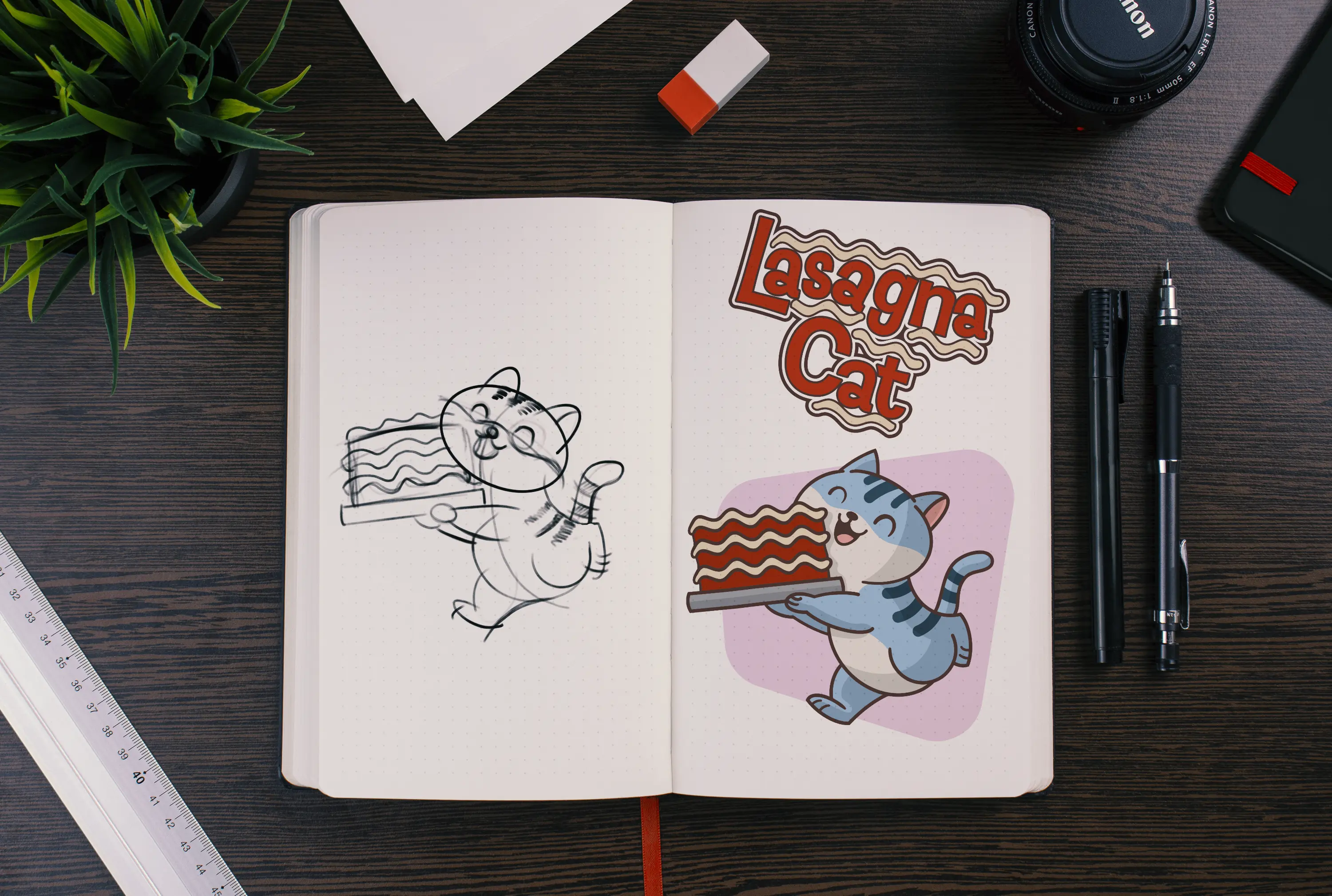
A Purrfectly Playful Identity for Lasagna Cat
Transforming a whimsical idea into a bold visual brand—complete with logo, character design, and a sticker pack that meows with personality.
Art DesignLogic Creativity
Imagination Unleashed
Sometimes, it’s refreshing to step back, stretch your legs, and create purely for the joy of it. Here’s a look at some of our passion-driven creative work — no deadlines, just imagination.
Style Guide Visual Identity
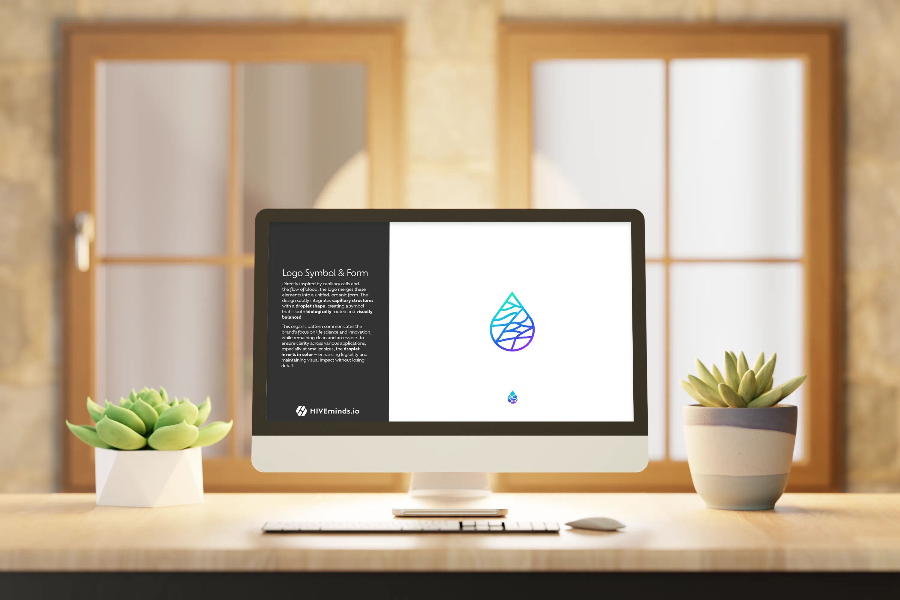
Refined Innovative BioTherapies Style Guide
Innovative BioTherapies, Inc. (IBT), is a for profit company founded in 2003, by Dr. H. David Humes, Professor of Medicine at the University of Michigan, to facilitate the commercialization of technology developed in his academic laboratory.

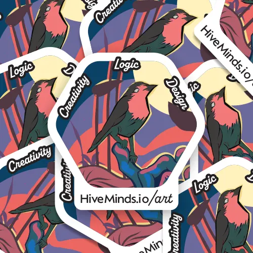
Logo Design Branding Multi Clients
Strategic Logos that Set the Stage for Your Brand Story
A logo is the start of a good brand because it creates the first impression, communicates identity, and sets the tone for all visual and emotional connections that follow.