SharpeSoft Style & Branding Guide

Having a clear and consistent brand is so important, and thanks to HiveMinds.io, we now have a Branding & Style Guide that makes it effortless. They really took the time to understand who we are and where we’re headed, creating a guide that not only reflects our values but also helps us present a unified, professional image.
From logo usage to typography, colors, and tone of voice, every detail has been thoughtfully put together to ensure our brand stays strong and recognizable. But this isn’t just a rulebook—it’s a foundation that will help us grow while staying true to who we are. HiveMinds.io didn’t just design a guide; they gave us a tool that keeps us connected to our customers and future-ready.

Willam Ontiveros
SharpeSoft
Consistency and clarity are essential in how we present ourselves to the world, and our new Branding & Style Guide, created by HiveMinds.io, achieves exactly that. With their expertise, we now have a cohesive visual identity that aligns with our mission, reinforces our professionalism, and strengthens our connection with our customers. From logo usage to typography, and colors, every detail has been thoughtfully crafted to represent SharpeSoft’s values and innovation. This guide isn’t just a set of design rules—it’s a strategic asset that will shape our brand for years to come. HiveMinds.io has given us the tools to confidently step into the future while staying true to our roots.

Client Brief
Overview
The SharpeSoft Brand & Style Guide will serve as a foundational document to ensure consistency and clarity in the company’s visual and communication standards. This guide must include the following key elements:
- Logo Integration
- Build upon the newly developed logo to establish a cohesive identity.
- Define guidelines for logo placement, usage, and spacing across various applications to maintain brand integrity.
- Color Palettes
- Introduce and standardize new color palettes that reflect the company’s modernized vision while aligning with its industry presence.
- Provide primary, secondary, and accent color options with clear usage examples.
- Typography
- Incorporate new typography styles that enhance readability and professionalism.
- Define font hierarchies for headers, subheaders, body text, and callouts to ensure uniformity across platforms.
- Logo Usage Standards
- Establish rules for logo usage on digital and print materials, including size constraints, background contrasts, and acceptable variations.
This guide will enable SharpeSoft to present a unified, professional identity that resonates with its audience and supports the company’s growth into the modern era.

Brand Logo
The SharpeSoft logo represents our commitment to innovation, precision, and partnership within the construction industry. Our logo acts as a bridge, reconnecting with customers and conveying a refreshed vision that is both engaging and valuable.
Primary Logo
The SharpeSoft primary logo is a modern design that bridges the company’s rich history with its forward-looking vision. Drawing inspiration from the classic logo treatment, this redesign integrates key elements from the past while modernizing the overall brand identity.
The updated logo features two core components: the logo graphic and the logo typography. The graphic element visually reimagines the two “S”s from the SharpeSoft wordmark, creating a distinctive and memorable emblem.
The multi-color design symbolizes SharpeSoft’s diverse range of product offerings, unified within a cohesive shape that reflects the company’s commitment to innovation and collaboration. This refreshed design embodies the essence of SharpeSoft’s brand and its dedication to serving the construction industry with cutting-edge solutions.
Logo Safe Area
Ensure proper display
To maintain the integrity and clarity of the SharpeSoft logo, it is essential to use a designated safe area. The safe area ensures that no other elements are placed too close to the logo, preventing visual clutter or distortion that may impact its perception.
The safe area around the logo is determined using the width of the letter “H” from the SharpeSoft wordmark. This measurement serves as a consistent module to define the minimum clear space required on all sides of the logo, ensuring it remains prominent and visually balanced in any application.


Logo Variants
The Right Fit
The SharpeSoft logo is designed with versatility in mind, ensuring it maintains its visual impact across various applications. To accommodate different backgrounds and contexts, the logo is available in two primary variations: light and dark treatments.
These options ensure the logo remains clear, professional, and visually appealing, whether displayed on light or dark backgrounds, preserving the integrity of the brand in all use cases.
Logo Variants
When Space is Limited
In instances where space is restricted, such as in social media campaigns, profile images, avatars, or compact marketing materials, alternative logo variations are provided.
These simplified versions ensure the SharpeSoft brand remains recognizable and impactful, even in smaller formats. The design retains key brand elements, ensuring consistency while optimizing for clarity and scalability in limited spaces.


Additional Logos
Expanding the Brand and Identity
Sub-logos play a significant role in SharpeSoft’s visual identity, extending the brand to its diverse products and solutions. These additional logos strengthen the connection between the overarching brand and the specific tools it offers, ensuring a cohesive yet flexible identity system.
Each product logo builds on the typography and style of the primary SharpeSoft logo while maintaining its own unique characteristics to reflect the individual product’s purpose and value.
Examples include the sub-logos for SharpeSoft’s key software solutions: Estimator, Reporter, Tracker, and Express. Each design reinforces the unified brand identity while providing distinct visual cues for each product line.
Crafting a new Logo
Expanding the basic logo shapes to keep its balance a unit of 3 help in expanding the basic elements into a balanced pattern.

Colors
Setting the right Vibe
The SharpeSoft color palette is designed to establish a bold and confident brand presence, reflecting the company’s energy, innovation, and expertise. These colors are integral to building a cohesive visual identity, ensuring consistency across all brand touchpoints.
Primary Palette:
A vibrant set of four colors—dark orange, bright orange, gold, and yellow—representing energy, optimism, and innovation. These bold tones help capture attention and reinforce the brand’s dynamic personality.
Secondary Palette:
A complementary range of neutral tones—deep gray, warm gray, gray, and light gray—provides balance and versatility, offering subtle and professional contrasts to the primary colors.
This combination of strong, bold colors and refined neutrals ensures flexibility in design while maintaining a consistent brand identity.
Primary Font
Why this font
The Impact font was the cornerstone of the classic SharpeSoft logo and brand identity, playing a significant role in shaping the company’s original visual presence.
This font was chosen for its bold, strong, and timeless design, perfectly aligning with SharpeSoft’s identity in the construction industry. By retaining Impact in the updated brand, SharpeSoft bridges its heritage with its forward-looking vision, ensuring a seamless connection between the past and the future of the SharpeSoft identity.


Secondary Font
Font Pairing
Proxima Nova serves as the perfect complement to the boldness of the Impact font. Known for its simplicity, clarity, and clean design, Proxima Nova offers a wide range of font weights and variants, making it highly versatile and adaptable across various applications.
This font ensures exceptional readability at almost any scale, from large headings to fine print, maintaining a professional and modern aesthetic. Paired with the strong and impactful nature of the Impact font, Proxima Nova adds balance and refinement, creating a harmonious and cohesive typographic identity for SharpeSoft.
Logo Usage
Keeping the Visual Identity Clear
To maintain the clarity and impact of the SharpeSoft logo, it is essential to ensure high contrast between the logo and its background. Selecting the appropriate logo variation for the context ensures that the brand remains visually distinct and professional.
For light-colored backgrounds:
Use the dark logo treatment to provide strong contrast and visibility.
For dark-colored backgrounds:
Use the light logo treatment to ensure the logo stands out clearly.
Refer to the examples provided to see the proper application of the logo on both light and dark backgrounds, demonstrating how to maintain a polished and consistent brand identity.


Logo Placement
Location Location Location.
Proper placement of the SharpeSoft logo is key to ensuring brand visibility and recognition. The logo should always be positioned in a way that makes it clear and easy for users to identify the brand.
The example to the right demonstrates optimal logo placement for maximum visibility and impact.
Always ensure the logo is placed in a clear area, free from clutter, to maintain visual focus and adherence to branding guidelines.
Maintain proper minimal spacing from edges or other elements to avoid overcrowding and uphold the logo’s prominence and integrity.
Consistent placement ensures a strong and professional brand presence across all platforms and materials.
Digital Business Cards
Show, Zap, Connect
Make connections effortless and seamless by leveraging the power of QR codes. By displaying a QR code, you can instantly share your contact information, helping people connect with the right person in just a few seconds.
QR codes provide a simple and efficient method to exchange information during in-person interactions, making networking and relationship-building smoother and more modern. Whether it’s at events, meetings, or casual encounters, a quick scan is all it takes to bridge the gap and establish a connection.


Trade Show Events
Branding & Visual Identity in the Wild
Bring your brand to life by showcasing it where your customers are—out in the wild. A well-designed trade show booth or display table can create a strong and lasting impression, connecting with your audience in a meaningful way.
Ensure that every visual element reflects SharpeSoft’s identity, from banners and signage to table displays and promotional materials. Consistency in design and presentation reinforces your brand, making it instantly recognizable and memorable in any setting.
Explore More Work
Design Logo Brand Identity
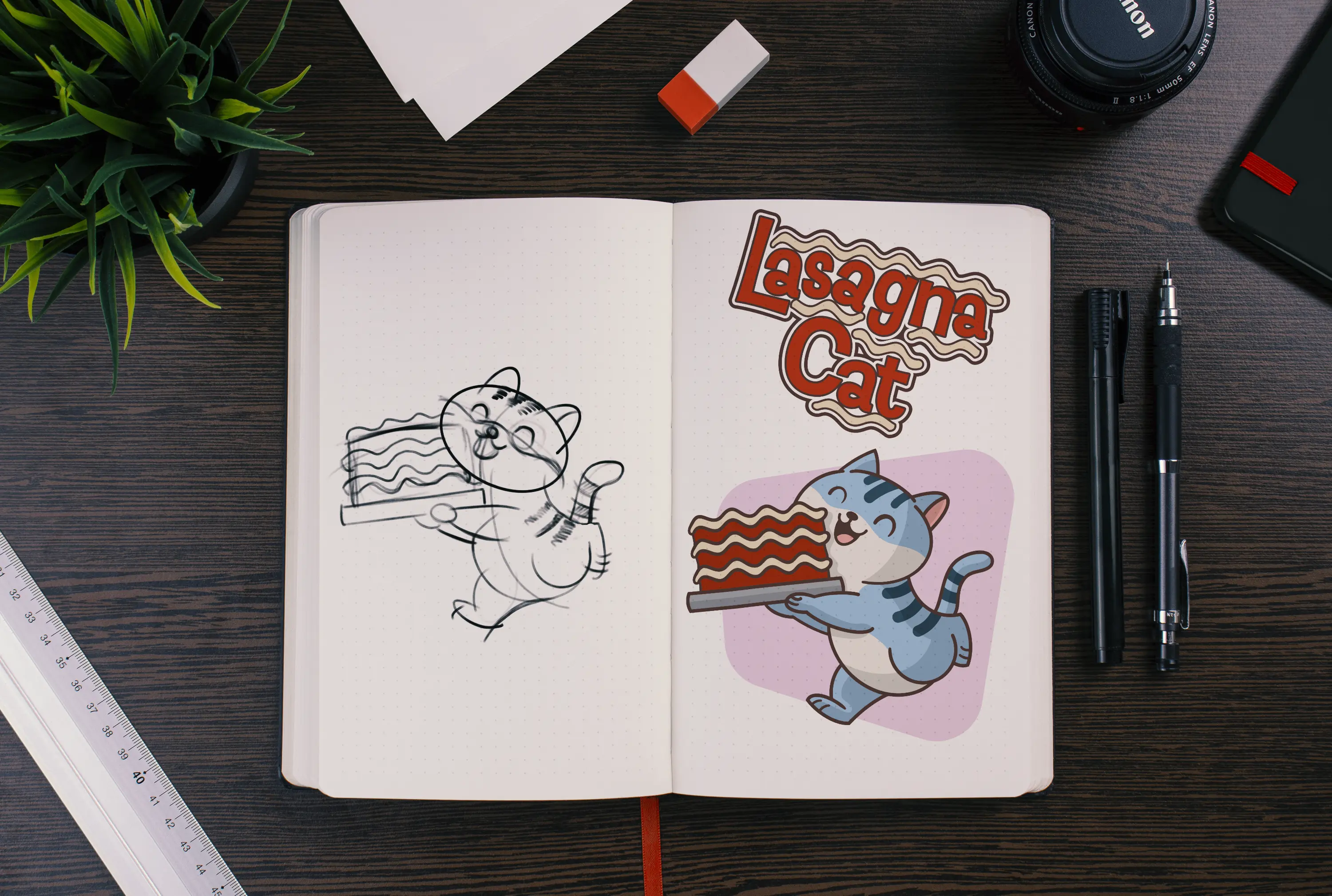
A Purrfectly Playful Identity for Lasagna Cat
Transforming a whimsical idea into a bold visual brand—complete with logo, character design, and a sticker pack that meows with personality.
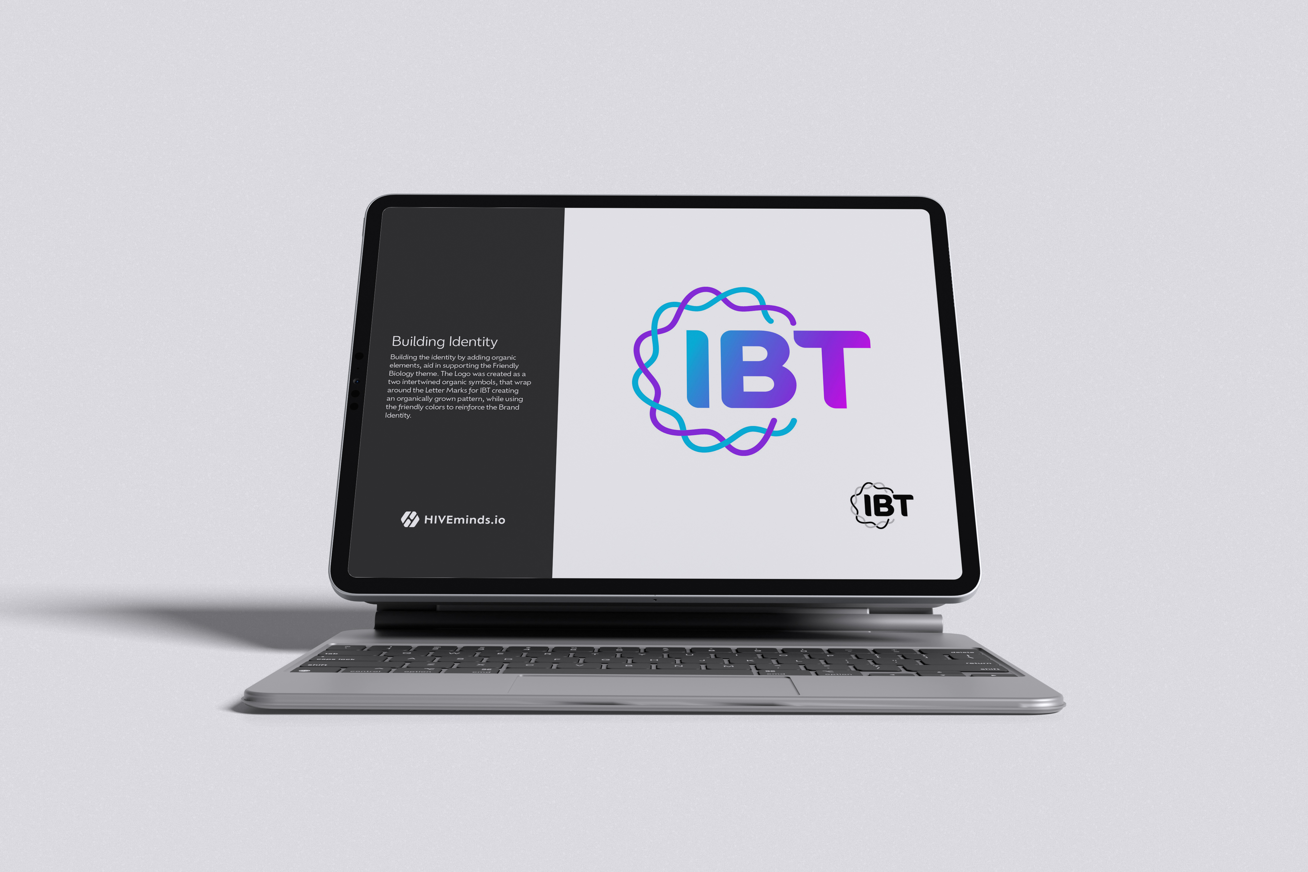
Style Guide Visual Identity
Innovative BioTherapies Style Guide
Innovative BioTherapies, Inc. (IBT), is a for profit company founded in 2003, by Dr. H. David Humes, Professor of Medicine at the University of Michigan, to facilitate the commercialization of technology developed in his academic laboratory.
Website Design Visual Identity Branding
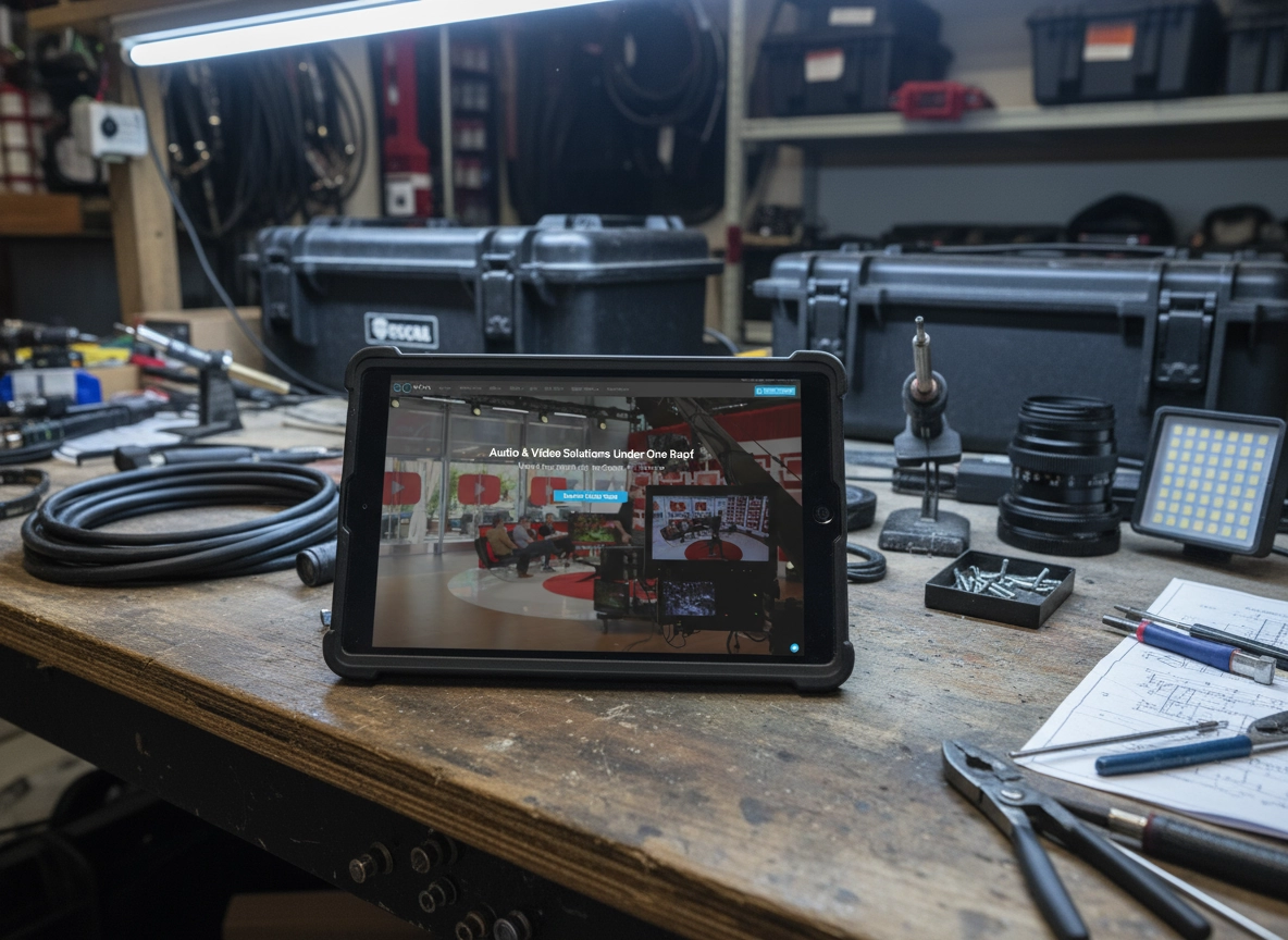
SoCal Production Website
SoCal Productions sought to overhaul its online presence with a modern website that captured the breadth of its audio and video rental inventory.

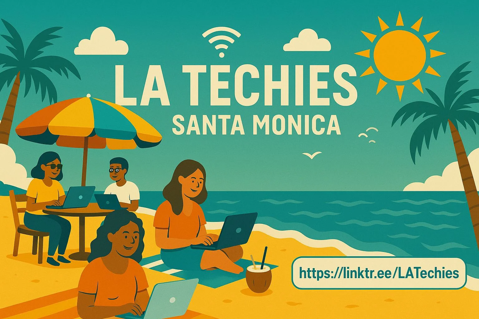
Logo Design Branding Multi Clients
Strategic Logos that Set the Stage for Your Brand Story
A logo is the start of a good brand because it creates the first impression, communicates identity, and sets the tone for all visual and emotional connections that follow.