Refined Innovative BioTherapies: Brand Identity & Style Guide

Client Overview
Innovative BioTherapies, Inc. (IBT) is a biotechnology company founded in 2003 by Dr. H. David Humes, Professor of Medicine at the University of Michigan. IBT is dedicated to the development of bioartificial organ-based devices that utilize adult progenitor cells, biomaterials, and MEMs technology. Their groundbreaking research is backed by federal grants and contracts, and their innovations support the commercialization of regenerative medicine therapies.
Project Scope
Blood, Droplet, Capillaries
Logo Base Concept
Following our discussion, several key terms emerged as foundational to the brand’s identity: Blood, Droplet, and Capillaries. These elements symbolize the essential biological processes that Innovative BioTherapies engages with.
Drawing from this inspiration—and with a focus on a stable, technology-forward approach—the new logo integrates these organic themes into a modern, refined design. The result is a mark that reflects both the scientific precision and trustworthy innovation at the core of the company, supported by stronger, more deliberate typography to reinforce the brand’s confidence and clarity.
-
Deliverables included:
- Logo redesign and treatment variations
- Color palette and typography system
- Visual style guide for digital and print applications
- Usage rules for brand consistency
Introduction of Colors
The introduction of color plays a vital role in elevating the logo and reinforcing the brand’s personality. By selecting tones that are both vibrant and approachable, the palette captures the energy of innovation while maintaining a sense of trust and accessibility. These colors not only enhance the visual appeal but also help tell the story of a brand that is both cutting-edge and human-centered.
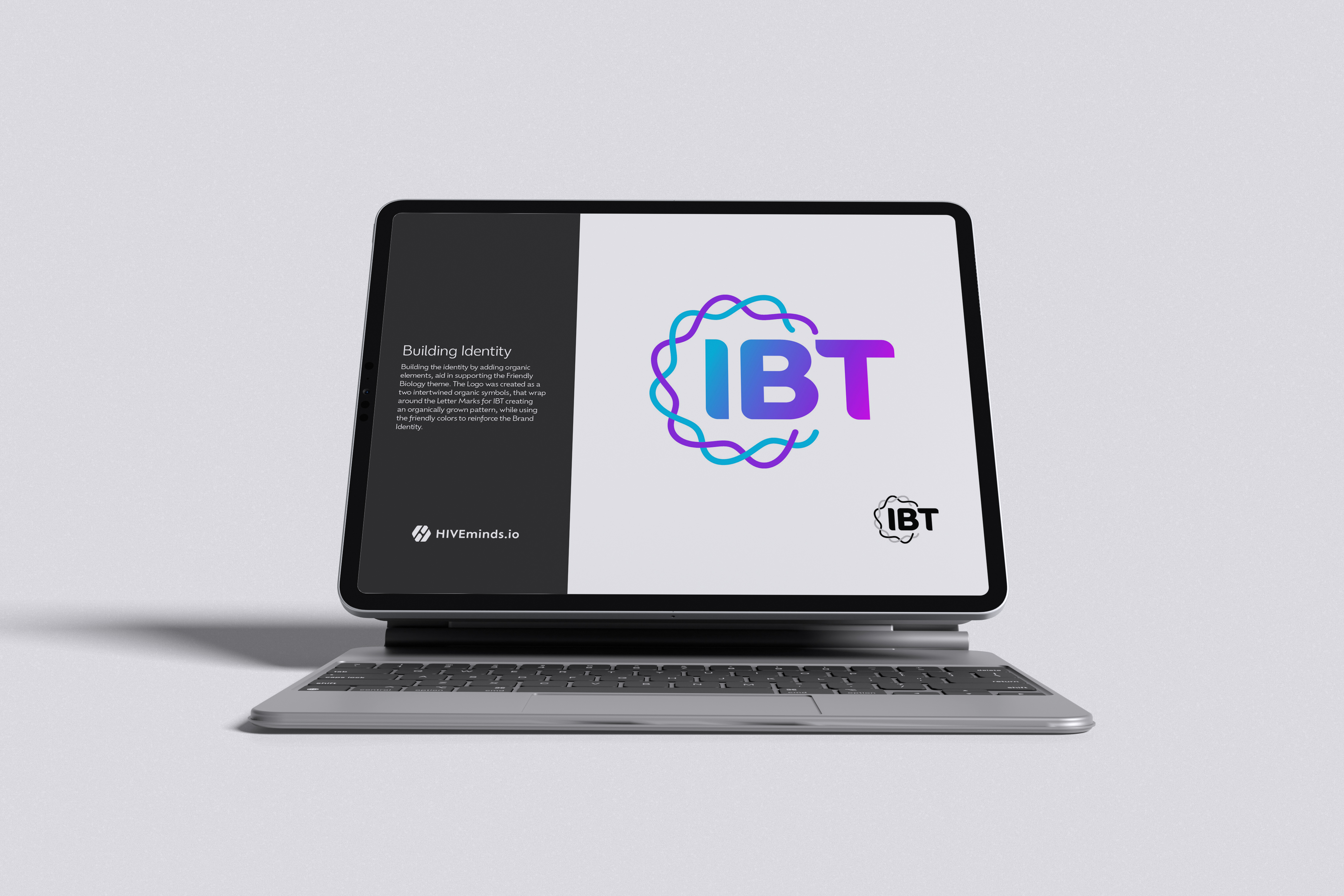
Logo Symbol & Form
Directly inspired by capillary cells and the flow of blood, the logo merges these elements into a unified, organic form. The design subtly integrates capillary structures with a droplet shape, creating a symbol that is both biologically rooted and visually balanced.
This organic pattern communicates the brand’s focus on life science and innovation, while remaining clean and accessible. To ensure clarity across various applications, especially at smaller sizes, the droplet inverts in color — enhancing legibility and maintaining visual impact without losing detail.
Usage Options
The flexibility of the brand system allows the logo icon and wordmark to be used independently or in combination, depending on context and space. This modular approach enables custom layouts that adapt to various formats while maintaining brand consistency.
Each configuration is designed to provide visual balance and strong brand presence, ensuring clarity and recognition across a wide range of placements—from digital interfaces to print materials and packaging. This versatility ensures the brand remains impactful, regardless of scale or medium.
Colors
The chosen color palette is both friendly and modern, designed to elevate the logo and broader brand experience. These colors convey an energetic, optimistic tone that reflects the company’s forward-thinking approach and positive intent.
By balancing vibrancy with approachability, the palette reinforces the brand’s mission to innovate in ways that feel both human-centered and trustworthy. It supports a visual identity that feels fresh, confident, and uplifting across all touch points.
Explore More Work
Style Guide Visual Identity
Innovative BioTherapies Style Guide
Innovative BioTherapies, Inc. (IBT), is a for profit company founded in 2003, by Dr. H. David Humes, Professor of Medicine at the University of Michigan, to facilitate the commercialization of technology developed in his academic laboratory.
AI Event Winner
Machine Cinema LA Event Winner!
What even is a sport? For our next GenJam, we’re working with our friends at Echobend to throw you into the arena with nothing but your imagination and a handful of weird, seemingly unrelated objects. Your mission: invent a new sport from scratch—and show us how it works. Think: a broom, a hoop, and a golden ball with wings. Never heard of Quidditch? Exactly.

Logo Design Branding Multi Clients
Strategic Logos that Set the Stage for Your Brand Story
A logo is the start of a good brand because it creates the first impression, communicates identity, and sets the tone for all visual and emotional connections that follow.
Brand Guide Style Guide Visual Identity
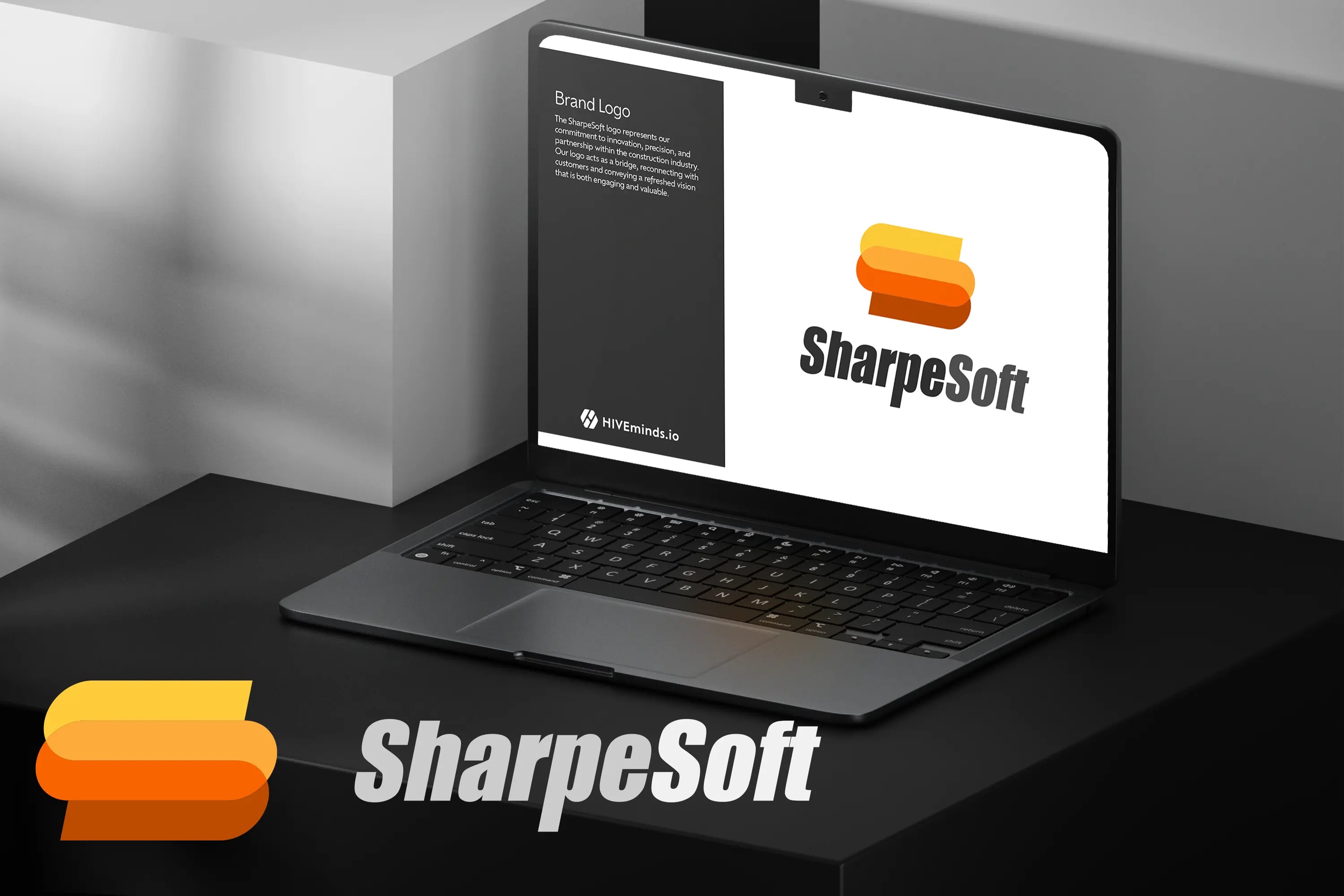
SharpeSoft Style & Branding Guide
With over 38 years of providing industry-leading estimation software for the construction industry, SharpeSoft has embarked on a journey to modernize its branding and visual identity.