Innovative BioTherapies: Brand Identity & Style Guide

Client Overview
Innovative BioTherapies, Inc. (IBT) is a biotechnology company founded in 2003 by Dr. H. David Humes, Professor of Medicine at the University of Michigan. IBT is dedicated to the development of bioartificial organ-based devices that utilize adult progenitor cells, biomaterials, and MEMs technology. Their groundbreaking research is backed by federal grants and contracts, and their innovations support the commercialization of regenerative medicine therapies.
Project Scope
Overview
We were brought in to develop a refreshed visual identity for IBT that would reflect their commitment to innovation and cutting-edge medical science, while remaining accessible and credible to both research and commercial audiences.
-
Deliverables included:
- Logo redesign and treatment variations
- Color palette and typography system
- Visual style guide for digital and print applications
- Usage rules for brand consistency
Design Approach
Our work focused on balancing a scientific precision with a forward-looking identity. The logo was refined to be more contemporary and scalable, with a sleek custom typeface and iconography evoking cellular structures and biomaterial networks. Color choices leaned into clinical clarity and trust—utilizing blues and neutrals with accent tones to allow for flexibility across scientific, investor, and government-facing materials.
Outcome
The resulting brand system positions IBT for continued credibility and growth in both the academic and commercial biotech spaces. The new identity is clean, professional, and structured to evolve with the company as they expand their reach and partnerships.
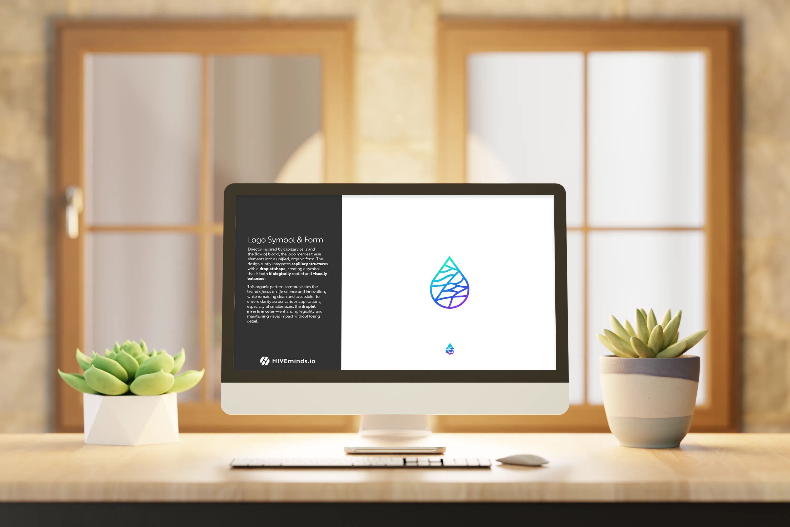
Understanding the Logo
The Logo focus on a friendlily innovative approach. The customized typography uses a San Serif font face that has been customized to soften the edges, crafting a more organic treatment. The Primary word mark incorporates the customized elements throughout the treatment.
Introduction of Colors
Elevating the logo using colors that are exciting as well as friendly, enhances the story of the innovative aspects of the Brand.
Building Identity
Building the identity by adding organic elements, aid in supporting the Friendly Biology theme. The Logo was created as a two intertwined organic symbols, that wrap around the Letter Marks for IBT creating an organically grown pattern, while using the friendly colors to reinforce the Brand Identity.
Balanced Options
Building on the Logo an alternative layout with the color treatment surrounding the logo help in making a larger impact for smaller areas.
Alternatives for Image Overlays
Having the need for overlaying the image on branded materials these two options provide the ability for the logo to be used on image overlays. If the layout has room the larger full color logo option should be used. On smaller more restrictive layouts the smaller logo with Dark Word-mark should be used so that the Text can easily be identified.
Colors
Friendly and Modern, these colors help elevate the Logos and Brand by providing an Energetic feeling of happiness as well as positive intent.
Typography
Type face that supports the overall branding is key to building the visual identity. The Font Family is called Locator, somewhat fitting for the nature of the Brand.
Locator has a variety of font weights and options to help create a solid branded Identity.
Explore More Work
Website Design Visual Identity Branding
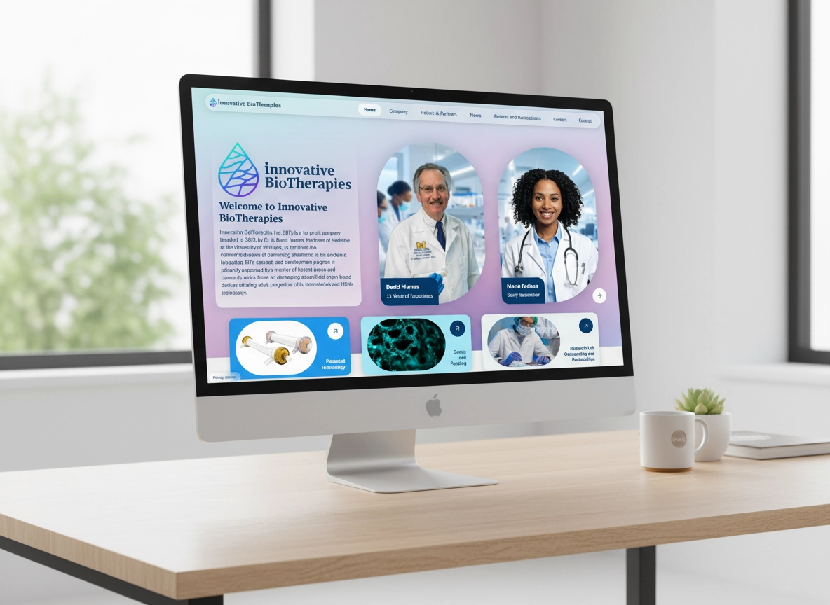
Innovative BioTherapies Website
A modern redesign and rebuild of the HiveMinds.io website focused on clarity, creativity, and conversion. The new site highlights the collective’s UX, branding, and design expertise through a clean, responsive layout and engaging storytelling.
Logo Website
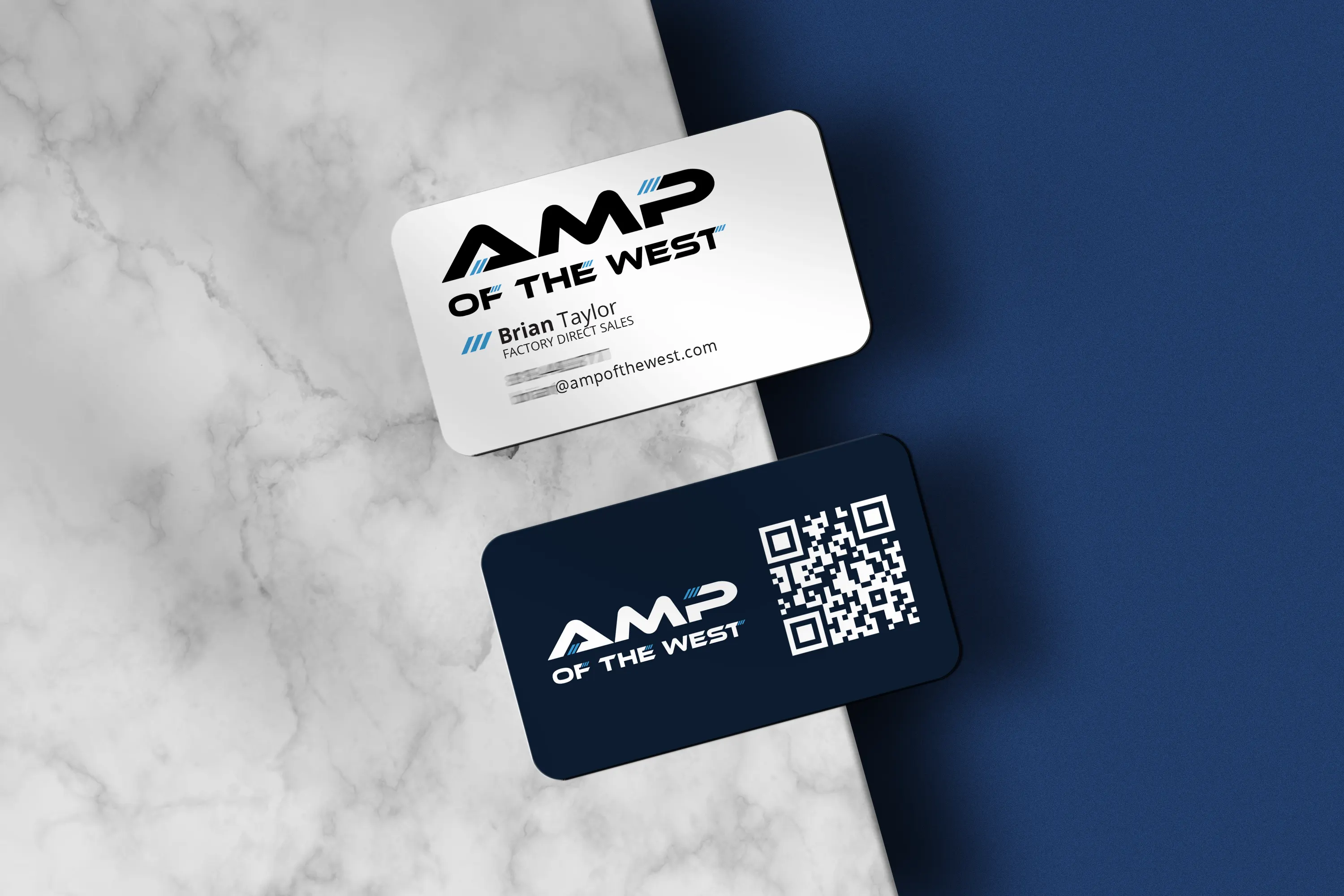
AMP of the West
Discover our branding and design work for AMP of the West, the exclusive West Coast distributor for American Marine Performance. See the new logo, website, and marketing collateral built for high-performance luxury boating.
Style Guide Visual Identity
Refined Innovative BioTherapies Style Guide
Innovative BioTherapies, Inc. (IBT), is a for profit company founded in 2003, by Dr. H. David Humes, Professor of Medicine at the University of Michigan, to facilitate the commercialization of technology developed in his academic laboratory.

Logo Design Branding Multi Clients
Strategic Logos that Set the Stage for Your Brand Story
A logo is the start of a good brand because it creates the first impression, communicates identity, and sets the tone for all visual and emotional connections that follow.